Painting the Psalms: Week One
This year has really deepened my understanding of the word endurance.
Every day has felt like I’m lost in the wilderness, wandering in circles around the desert. No compass, no map, no plan. It’s been disorienting. A season of pruning, of stripping everything away to make room for new growth. I wanted to start a daily art practice, but I know myself too well to force myself into any repeating activity. I struggle to finish things that have no set boundaries, let alone commit to a daily practice of any kind (it makes me feel suffocated and overwhelmed).
But I felt the Lord encourage me to “Paint the Psalms.”
God is funny, and He really knows us intimately. My brain *can* commit to a daily practice if there’s a set goal in mind—and this goal happens to achieve two things I’ve wanted to do 1) read the Bible more faithfully 2) take my art more seriously. The achiever in me is fueling the creative in me, which is driving motivation in parts of my brain that have been dormant for many months.
Week One

psalms 1-7
It definitely took me longer than 7 days to do this daily art exploration for the first 7 Psalms, let’s be real. Part of my problem, I discovered, is that I would get started really late in the day, and then it would be way too dark outside to even take a picture of the Psalm to capture for sharing purposes, which would delay everything by a day. (I hate the winter time change so much—it’s dark all the time.) Plus, I started sharing process videos for each Psalm, which took time to edit—and blah blah—this is going to take way longer than 150 days.
Overall though, it’s been a fun challenge. We’ll see how dedicated I am in a few weeks’ time to finishing this series. Ironically, painting them has been the easiest part. It’s the documentation and social media aspects of this project that are super annoying (writing captions, taking pictures, making graphics, editing videos, posting at the right time). Eye roll. But that’s how art works these days, unfortunately.
I don’t have to document the process online, but if I don’t show up online, then I can’t build my email list or reach potential collectors when I launch art in the future, so it’s a necessary hassle I’m still working through. I am appreciative, though, that with social media we can reach all kinds of folks across the world who share the same passions and interests we do.
Psalm 1

“psalm 1” | 6×6 | gouache, oil pastels
This composition was inspired by the tree that “yields fruit in its season” and does not wither. I choose deep, rich hues of green and purple to express the abundance expressed in this psalm. After a week, this is still my favorite composition out of all seven.
Psalm 2
“psalm 2” | 6×6 | gouache, oil pastel, charcoal
If I had to pick a color to display the Lord’s wrath, it would be the color Carmine. It’s a deep, rich red with hints of purple, closer to a true red than crimson. For this piece, I paired this deep red with purples, greens, and charcoal to contrast the Lord’s fury with the refuge of His Appointed. This composition is a bit jarring, and so is Psalm 2.
The most striking part of this psalm is “He who sits in the heavens laughs.” It’s a psalm that should make you pause—it inspires the fear of the Lord. It asks the question: where does your allegiance lie? With those in opposition to God? Or in the refuge of His Son?
Psalm 3

“psalm 3” | 6×6 | gouache, soft pastel
It’s really beautiful when the psalmist says, “You, O Lord…are the lifter of my head.” This phrase has carried with me throughout the week, especially as I’ve walked through challenging days.
For this art scrap, I used bright yellow colors to reflect the salvation, protection, and hope represented in the psalm. I wanted this piece to feel very saturated, like staring into the sun. I used soft pastels this time to achieve a highly pigmented look.
Psalm 4

“psalm 4” | 4×4 | mixed media
I woke up on this day wanting to paint with purple. Not for any significant reason. I’ve been really into this emerald green and bright lilac combination, so I figured purple would be a good base for those colors. I intended to do a soft lavender watercolor base, but ended up with a vibrant red violet with aubergine. It started off well, but then I messed up on the oil pastels and had to start over.
Joy is the central emotion of this psalm in my mind, which I typically use lemon yellow or fresh green to symbolize. But when I tried to incorporate that, it looked so bad. So I went back to a dark purple and just added charcoal. That’s how the final composition came together.
The psalmist writes, “you have put more joy in my heart than they have when their grain and wine abound.” I think this piece is the color of a deep wine in the end.
Psalm 5

“psalm 5” | 6×6 | watercolor, soft pastel
This psalm got me thinking about the house of the Lord. What it looks like, smells like, feels like.
“But I, through the abundance of your steadfast love, will enter your house. I will bow down toward your holy temple in the fear of you.”
That was the inspiration for this piece. I went with watercolor in yellow and red shades to make a hazy orange. I wanted it to feel like clouds, without there being any specific cloud shapes. This composition is much more subtle than my other ones. I ended up making two at once because I was rusty on using watercolors and wasn’t sure which technique would work better. Now I can’t pick which one I like more, though I’m leaning towards the smaller one.
Psalm 6

“psalm 6” | 4×4 | gouache
How long? It’s a question asked often in the Psalms. How long will I feel so troubled? How long will things remain this way? How long should I have to wait?
What I love about the Psalms is that they always end with eyes looking upwards, no matter how dark they are in the middle. It’s a posture of humility, of hope—though the Psalmist is “anguishing” in Psalm 6, he believes the Lord will deal with his enemies in “just a moment.” He doesn’t walk away in a place of despair but stands firm that “The Lord has heard my plea.”
I was told once that abstract art looks more interesting if nothing is ever sitting “on top” of the piece, meaning that the colors carry throughout and there’s no one distinguishable layer. Generally, I break this rule because I like having dramatic elements pop out and feel disconnected. But for this painting, I felt that complex layering was necessary. I took bright shades of blue and then contrasted them with dark and emerald greens. I had planned to do thick oil pastels in similar shades on the top, but I ran out of sunlight and decided to just let it be gouache.
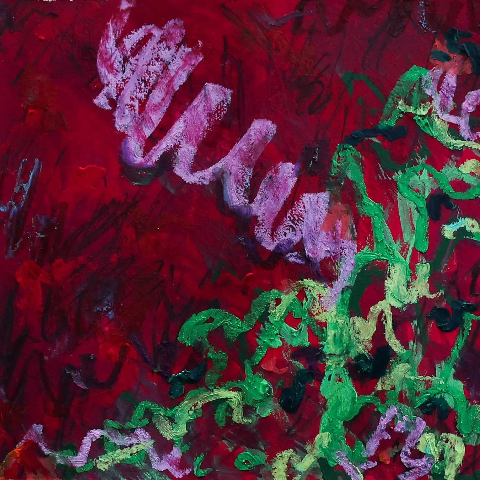
Psalm 7

“psalm 7” | 6×6 | mixed media
This psalm is passionate—that’s one of the translations for the musical term “shiggaion” in the description of Psalm 7. It can also mean “wandering” or “to stagger about,” though experts aren’t 100% sure what it is or what it would have sounded like (some fun Bible trivia!).
I aimed to depict this wild, raving emotion in the brushstrokes and color palette. I like to use charcoal when I want my composition to feel unhinged, which is probably a great way to describe King David since he basically danced in the streets half-naked. With a fluorescent base, charcoal scribbles, and thick pastels—this composition is stark and unsettling. It’s another one of my favorites from this week.
See you next week!
Which one of these do you like the best? I like that they’re all different. Follow along to see Psalms 8-14 next week(ish). I post daily on Instagram and TikTok with weekly recaps here (and on Substack).